Design Faux-Pas to avoid
A "Faux-Pas" is an embarrassing social mistake or blunder.
The following things are "design faux-pas" that we would like you to avoid...
The following things are "design faux-pas" that we would like you to avoid...
1) Ignoring principles of design
No contrast? No repetition of design elements? Misalignment of objects? No grouping of related objects? Just NO.


Alignment problems
|

Alignment problems: different sized margins and text touching edges
|

Alignment problems
|
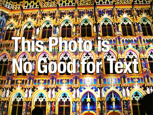
2) Low-quality images
Grainy, blurry, out-of focus, bad lighting, disproportional ... if the photo has these noticeable flaws, don't use it!

3) Crazy font combinations
It's good to use a mix of different fonts in your design, but some font combinations just don't look good together. As a general rule, don't use more than 3 different fonts in the same design. Also, make sure the style of your fonts matches the mood of your design.

|

|

|
4) Too much stuff
Don't create an explosion of pictures, shapes, lines, and colors! Be intentional about placement and use of blank space.

|

|

|
5) awful color combos
If you can't tell which colors look good together, ask multiple other people to share their thoughts on your design. Or, visit a color website like http://design-seeds.com/ to get some help! Be careful with bright, neon colors: always match them with other muted colors.

|

|

|
6) Busy, distracting backgrounds
Can't read the text because the background is too crazy? That's no good.
|

|

|
7) Bad Visual hierarchy
"Visual hierarchy" is the order in which a viewer processes information in the design. Our eyes go to the largest and brightest items first (so in general, you should make important items larger, and unimportant items smaller). This is why headings are always bigger than body paragraph text.

|

|
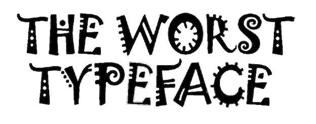
8) Fonts that Aren't cool anymore
In design, fonts go in and out of style. Right now, simple clean fonts and script fonts that look like actual handwriting are very popular. Here are a few fonts that will immediately make your design look like it's from the 1990s or 2000s:

Curlz MT
Jokerman
|

Comic Sans
|

Papyrus

Brush Script
|
9) Other text problems
Ensure that your text is readable. Don't fall for these common problems:

Body paragraph text should never be cursive or decorative.

Basic underline is no good.

Don't hyphenate text.
|

Deep drop shadow on text :(
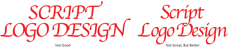
Don't ever put a script font in all caps!

What is this supposed to say?
|
10) Cartoony clip art
"Clip art" is a pre-made graphic image. If you can find chic, professional looking clip art that is free, by all means, use it. However, most clip art is cartoony and cheesy.

|

|

Clip art: cheesy pre-made graphics
|
11) Photoshop Fails
It's easy to overdo things in photoshop. Don't cut off body parts. We don't want to see unnaturally skinny faces or bodies, bent trees or walls, or any sort of unnatural imagery in your designs.

What is this photoshop mess?
|

Is it supposed to look like she is really sitting on this car?
|

Where is her leg?
|
Other bad Ideas:

Color overload.

Awful logos
|

Cartoony or childish styles
|
